Brussels Airlines has unveiled its new brand identity, as part of its Reboot Plus transformation programme.
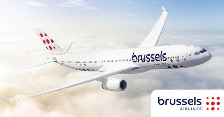
The rebrand consists of updated colours, a new logo and aircraft livery, which the airline says are the “visual token of its new chapter”.
The new brand identity includes a new version of the Brussels Airlines signature red and blue colours, now a deeper red and a darker shade of blue. The dotted “b” on the carrier’s logo and tailfins has now been replaced for dots of different sizes in the form of a square, to represent the diversity of the airline’s customers, destinations, and employees.
The two words of the brand name are now stacked, with the word “brussels” gaining more importance with its larger type font to emphasise the airline’s Belgian identity. The new aircraft livery, shows a zoom on the dotted logo on the tails, a fresh white body and a continuation of dots in different shades of blue and grey.
The COVID-19 pandemic has accelerated Brussels Airlines’ transformation plan Reboot Plus, in order to pave the way for a future-proof company that is able to face the competition, with a sound and healthy cost structure.
After the restructuring, the company started the second phase of its Reboot Plus plan: the build-up and improvement phase. Brussels Airlines has stated that it is now focusing on the future with strategic investments in an improved customer experience, new technologies, digitisation, new ways of working, and the development of its employees.
Commenting on the news Peter Gerber, CEO of Brussels Airlines, said: “We want to clearly mark the start of the New Brussels Airlines. For our customers, who deserve the best, but also for our employees, who are committed to the transformation that we’re pushing forward and to which they contribute every day.
“That is why we present the visual translation of our new start. With this new brand identity, we are ready to show our customers, our employees, our partners and all other stakeholders that we are turning a page.
“As one of the four Lufthansa Group network airlines, we are building the way towards a promising future. We see this new brand identity as a symbol of confidence in our company, re-emphasising our identity as Belgium’s home carrier.”
In addition to the new visual identity, the airline has introduced a new tagline – “You’re in good company”. Michel Moriaux, Head of Marketing at Brussels Airlines, explains: “We have chosen for a tagline that underlines our most valuable asset; the hospitality brought to our passengers by our incredible staff. Their way of working, on and behind the scenes, ensures that our passengers are in good hands. By committing to transparency, by investing in a greener and more comfortable fleet, by being 24/7 available and by making sure that our passengers sit together without an extra charge, we want to offer our customers what really matters to them. No small print, just common sense.”