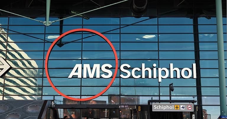
With a new look in the terminal and online, Schiphol – a Corporate Partner of the FTE Digital, Innovation & Startup Hub – wants to offer travellers more calm, clarity and recognisability. The new brand identity is part of a large-scale improvement and investment programme designed to raise the quality of the airport to a higher standard in the coming years.
Schiphol is investing in an airport that is ready for the future. With better infrastructure, more space and an enhanced experience for travellers, airlines and employees. The new style supports this new direction and gives the airport a recognisable and coherent image, both physically and digitally.
With its central brand concept, ‘Today is the day’, the airport shows that every day at Schiphol revolves around making a difference for travellers. ‘Today is the day’ is all about the feelings that travellers experience at important moments, whether it’s the day of departure, homecoming or encounter. It’s about the excitement of a new adventure, the joy of a reunion or the start of something big. Schiphol wants that day to run smoothly and pleasantly, with clarity and confidence.
Schiphol was originally designed around the needs of travellers – the airport should offer calm and clarity during the travel process. With its revamped visual identity, Schiphol is bringing back a sense of quality. The new design ensures recognisability in all communications, from screens in the terminal to information on mobile phones.
“The updated brand identity is the visual representation of our ambition,” said Arthur Reijnhart, Chief Commercial Officer, Schiphol. “We are bringing clarity and coherence back to the airport, and a sense of calm back to the travel process. This is an important step towards becoming a high-quality airport. Schiphol is a home for world travellers and, together with all colleagues at the airport, we make that special day of travel possible every day.”
The new brand style will appear in the coming days at Schiphol Plaza, in the arrival halls, on the first electric buses and, from 14 October 2025, on digital channels. This autumn, the facades of departure halls 1, 2, and 3 will follow. Over the next two to three years, the updated identity will be gradually implemented throughout the airport, ensuring a consistent and enhanced Schiphol experience.
For its new look, Schiphol has returned to the design principles that have characterised the airport since the 1960s: clarity, simplicity, a forward-looking approach and an unmistakably Dutch look and feel. The revamped logo features two central elements: an orange line and a circle with the letters AMS, which refer to Schiphol’s international IATA code and are instantly recognisable to travellers from all over the world. The orange line forms a connecting element in all communications.


